Making the Tipi – Part 3 (Post Blog Submission Update Post)

On thursday I was upset to find my structure on the ground and 2 of the poles snapped. I figured this was because it had been very stormy and windy on Wednesday, also the spot in the front of the department close to the road was not well protected from winds.
I moved my tipi much closer to the building to shelter it and rebuilt using the remaining 8 poles. Luckily it was ok!


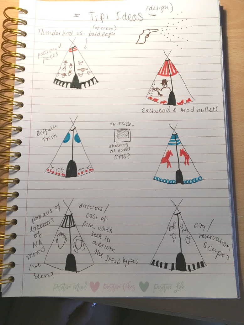
I unrolled the fabric and was surprised to find that it went on easily compared to before. The lack of wind made it easy to pin up. However I realised that the design I had cut on the fabric was a little too small. However, I worked around this and sewed the door shut and made a new entrance hole from this. I also tied each pole to the canvas with string for extra support and to stop the fabric from getting caught in the wind. I think that it still looks good despite my blunder, and it feels much stronger than my previous structure.
I believe that it will not fall down before the examinations are over.


I left Thursday night with a little paint on and the structure securely shoved into the ground. When I came back friday morning it was still fine and I began to paint it with black acrylic. The scenes and quotes are all from the movie, Smoke Signals, 1998, directed by Chris Eyre.

Friday morning found me finishing all the painting and creating a little fire pit (just for a little extra feel inside – not to be used for health and safety reasons!!). I decided to paint quotes from one of the funniest and most bittersweet moments of the film which is when Viktor and Thomas are on tthe coach to Phoenix and they get their seats stolen by some old white cowboyesque men. Viktor teaches Thomas that “if you’re not mean the white men won’t respect you” “you gotta look stoic” (in reference to the Edward Curtis image of NA) “you have to look like you just got back from killing a buffalo”.
Thomas naively replies that their tribe were fishermen, which exasperates his friend, “you wanna look like you just got back from killing a fish? This isn’t dances with salmon you know!” I thought the comedy and sad truth in this interaction fitted well with the overall  message I’m trying to convey.
I also included the song they sing on the bus to strengthen their bond after their little fight, about how in all of John Wayne’s movies, you never saw his teeth.
“John Wayne’s teeth hey-ya John Wayne’s teeth! Are they fake or are they real? Are they plastic are they steel? Hey-ya he-ya”
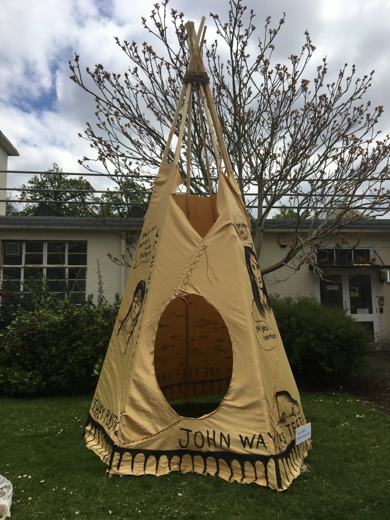
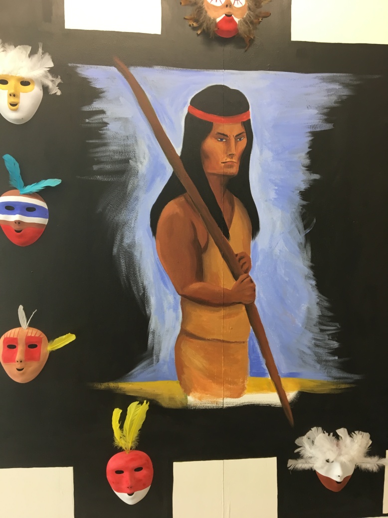


IMG_8267

The finished piece

Overall after completion of this piece, I am happy and satisfied that I have done my best and challenged myself like no other art work I’ve made before. Usually I stick to the safety of painting, but I’m happy that this time I pushed myself.
I believe this work to be a successful critique and answer to a lot of the problems stemming from Hollywood in regards to Native American representation and stereotyping. The film set fabric and tipi serve as a canvas for a revisonist and NA produced film which addresses these problems in a way that is both funny and real. I hope that the audience interpret it the same way, even if they have not seen the film, the message comes across.


Making the Tipi – Part 2 (Post Blog Submission Update Post)

Due to adverse weather conditions on Wednesday (storm and very heavy rain and wind) I could only put the wooden structure up this Tuesday the 1st of May, even though I wanted to finish the whole thing today. I attempted to put on the cover but the wind was very strong and I was scared tomorrow it might blow up and away. The heavy rain could also be detrimental to the acrylic paint I plan to put on it. Therefore I will wait a little longer.

To raise the tipi I lay two poles together and one across at a 30 degree angle as advised on https://www.wikihow.com/Make-a-Teepee. I tied a clove hitch to secure it and I raised it easily into a tripod shape which was really fun to do.

IMG_8187

The first tripod structure

After this first easy step, I then added poles one by one in an anti-clock wise direction starting from the front door pole which is the one furthest away in the photo. After puting each pole up, I wrapped the rope around the whole structure once. I also left out the 10th pole which goes right at the back as this will be the flag pole which the canvas will be unrolled from. This process was easy and fun!

Once the structure was up, I could focus on cutting the massive fabric sheet and attaching this to the flag pole. Unfortunately I forgot a pen so couldn’t stencil the design first however I was able to cut the semi circle, smoke hole and door flaps in what I think is an appropriate way. I used https://www.wikihow.com/Make-a-Teepee for the right shape and proportions. The windiness made it difficult to cut as the sheet is so huge, it was hard to keep steady. The weather is definitely intent on making this more of a challenge, as, I mentioned previously, it was far too windy to tie the canvas shut on the structure. For now I have left the flag pole and rolled up canvas inside ready for Thursday installation:

Making the Tipi – Part 1

I have decided that for my last piece in this term I would like to construct a tipi and place it outside on the lawn of the art department. I feel that this tipi, made from some poles and reused film set fabric, is a great canvas which I can paint or embroider my message onto. It essentially is a giant canvas load with political meaning as a structure outside of a colonial framework.  Since it will be near the entrance of the department I want it to be striking, and I want the audience to be immediately intrigued and want to come inside.

The fabric acting as the canvas will be painted with scenes and portraits from the film, Smoke Signals (1998), as well as some decorative edging and pattern. I decided on this film as I want to promote a way of providing the audience with a positive answer to misrepresentation rather than an entirely critical stance.


Stage 1 – Cutting the Wood

For the first stage of this process I bought and cut some wooden poles. I ordered 5 3 metre long poles which were then cut in two to produce 10 poles. I cut the ends at an angle so that they could be pushed into the soil and create a stable tipi.  I then stained the wood so that it would be waterpoof and not look factory fresh pale.


Stage 2 – Selecting, stitching and cutting the fabric 

I chose this fabric as it was a unwanted roll from a film set. The fact that it came from a production studio means that the choice of material is relevant for the role it will be playing as a critique on Hollywood cinema. I measured out x2 6 metre strips of the material. Since it has 140 width it will be enough to cover the 3 metre poles at a total of 3×6 meters once all stitched or glued together (since the top isn’t covered anyway).


After this I took the 2 strips home and glued the seams at either end down using a glue gun to ensure a neat finish. After this, I began to attach the 2 strips together in the middle to form the 3×6 rectangle which a semi circle would then be cut out of. I took this fabric home so that I could stitch and glue it together and lay it out flat somewhere that wasn’t rainy (weather predicted it to rain all week!). First I was generous with a glue gun to neaten up either end of each strip on the hem. Once that was dry I began stitching and gluing the middle together to make the massive rectangle. I decided to both glue and stitch as I was worried this would be the weakest point in the fabric if a harsh wind was to blow. I plan to secure the fabric on the inside of the tent once it’s installed with extra thread around the poles and maybe pegs at the base but I’m not 100% sure yet.


After everything was secured I lay out the shape as best I could with the space limitations. I used the site http://www.inquiry.net/outdoor/native/skills/teepee.htm and https://www.wikihow.com/Make-a-Teepee for the right measurements as they have made a tipi my size before. It was very useful to know where to put the door flaps and to allow enough room for a realistic smoke hole. Without this resource I probably would make a lot more mistakes. I will wait unti Tuesday before I cut it however, as there is not enough space in my house.

bbr229


SaveSaveSaveSave

Making a Tipi – Idea gathering

I decided that one way in which to make an effective art piece about misrepresentation of Native Americans would be to construct one of their most iconic symbols: a tipi. This I can decorate on the outside as the canvas would be large. Audience members can also come inside to add an interactive element. I’m still not 100% sure at this point that this will be my last piece for the term but I quite like the idea and it would definitely be a rewarding challenge to get right.

Actual Construction

For making a tipi I would need a lot of very long wooden poles, which I think would be the most difficult part. I’m not sure about where to source these and after looking online I have concluded it would NOT be cheap!
However I have discussed with one of my tutors and she has said that I can cut it in the art workshop to 3 meters in length for an afordable price. I will definitely consider this if I chose to follow through with this idea.

http://www.inquiry.net/outdoor/native/skills/teepee.htm

https://www.wikihow.com/Make-a-Teepee

I would also need this spray to waterproof the canvas and protect the acrylic from heavy rain, such as acrylic varnish spray or a general waterproofing spray.

Screen Shot 2018-04-26 at 14.09.59

What to put on it?

The reason why I want to construct a tipi is mostly because of the large surface area of the canvas that allows you to show drawings / paintings / embroidery or anything else. I want to show scenes of Hollywood injustices on the canvas but in a way that aren’t entirely obvious at first glance. I want it to naturally blend in with what people expect to see e.g. buffallo, patterns etc. However there may be something strane about it which captures the audience’s curiosity. I want them to be intrigued, see the humour and the problems in the outrageous misrepresentaiton in HW and also to come inside the tent!

Authentic 19th century tipi designs (mostly Lakota):

Not Authentic contemporary designs:

IMG_8129

Design ideas for the outside canvas


SaveSave

SaveSave

Geronimo 1962

IMG_8051

For this painting I wanted to address the issues of Hollywood representation I explored in my post focusing on film. Chuck connor as a six foot blue eyed Geronimo caught my attention as a clear example of the ridiculous casting that can be found.
Although this film is from the 1960s, and some would argue that it’s an outdated example to use, I still believe that the essense of  white-washing and appropriation is still a hot topic in the film industry today.

I started by creating a background inspired by Donald Rodney’s ‘How the West Was Won‘ (1982). The black and white is reminiscent of film rolls and I wanted to include this.

After I had created the background I began adding in some masks which I had created at home. This was inspired by the faces used in Nicholas Galanin’s work. The reason I chose masks was because I felt as if real Native American actors were usually cast as background characters in films about the west, hardly ever the main character. The randomly decorated masks are painted in a style of ‘war paint’ which I see in a lot of films, in which the real meaning and symbols are for the most part ignored by HW makeup artists. I appropriated feathers and paint to make fake background characters. This will hopefully amplify a feeling of alienation in their own movie Geronimo, further demonstrated through the painting of Chuck in the foreground.

00084604-309x400

Image of Chuck as Geronimo which I included in the painting.

SaveSaveSaveSaveSaveSaveSaveSave

SaveSaveSaveSave

‘Sioux’ Dress?

I decided to make a dress out of the novel Dances With Wolves by Michael Blake (1989). I used pages of the book to construct one of the costume dresses from the film. This was to raise questions to the audience about the authenticity of Hollywood costume.
The ‘Sioux’ dress from this movie adaptation was authentic according to Michael Blake and overall the film did strive for historical accuracy.
However even with the upmost care there were still errors, such as the fact the actors all were taught to teach the female version of Lakota language.This is highlighting the fact that even though a film could try hard, there will still be problems. In addition the main heroine of the film was a white woman raised by the Sioux, creating that feeling that yet again, two white characters have the main roles despite this being a film dedicated to Native Americans.  Although I love this movie, I really wanted to look at it critically. As its so well loved, aspects mentioned before have been overlooked. I aim to address this in this piece.


I started by using a hanger as a frame in which to construct the fake Sioux costume. This dress took a long time to make but was not too fiddly in construction. I have attached photos below of the entire process:

To install the work, I created a green rectangular background similar to that which the horse head hung on. I thought it would create a sense of continioty as they are both about the affects of Hollywood on the perception of Native Americans. This specific theme from my interest in Postcolonialism has been one of the most interesting projects I’ve done in the course of art since I came to Reading, I cannot wait to create more and bring awareness to my audience about this issue that a lot of people don’t really care about.

IMG_7460


SaveSave

Horse Head

IMG_7315

For this piece, I was inspired by the many artworks I’ve been researching. In particular the popular images of Native American culture through books, movies and art. In particular the artwork of Charles Marion Russell, which set the standard for classic depictions of the ‘Old West’ as seen in my previous research post.
Many depictions and associations of Native people revolve around riding horses; the freedom and wild spirit they represent. I decided to use the icon of a horse to reference this common association. I have made a goofy horse prop to lie against the green screen background. I used some found materials and made the overall look non-professional to reflect the cheap and often lazy attitude found in Hollywood when it comes to authenticity of Native American cultures.

Stage 1: Making the frame
For the first stage of construction, I created a wireframe from a sheet of chicken wire which I can later plaster. It was difficult to get smooth lines with the wire which I wanted, but nonetheless, I achieved the right shape for a horse’s head with no major difficulty.

Photo on 06-03-2018 at 16.04

Stage 2: Applying plaster bandages
Once I had constructed the head I went ahead and prepared strips of plaster bandage. I soaked them in water for a few seconds and then wrapped around the frame. I did 2 layers and this achieved a good sturdy structure which could be painted. It took 24 hours to fully dry.


Stage 3: Painting and decorating

After the plaster was dry I painted the horse head with acrylic paint. I included the type of Native American horse paint seen in films. The circle around the eye is supposed to increase the horse’s ability to see any danger, and a handprint on the neck is a message to opposing tribes that they are seeking vengeance (http://horsesoftheearth.wikifoundry.com/page/Indain+Horse+Markings). I also added feathers behind the ear as this is known to bring power.  I decided to make a mane out of plastic bags as I wanted the horse to look like a goofy prop against the green screen background. Again, the use of cheap material is a reflection on the cutting-corners attitude of Hollywood when it comes to NA.


Stage 4: Hanging 

Finally, I painted a large square on the wall green and hung my horse there. I wanted the green to remind the viewer of a green screen used in movie production. The horse head protruding out of the green is almost like an element of a 2D film coming into 3D. In addition, it also reminds us of a Green card. This raises questions about immigration, the right to live in America and why it’s so prized. When we consider that Native Americans are Native, it almost seems funny that everyone else there is an immigrant in need of this card.
Overall I enjoyed making this and I think it will lead me on to some more explorations into representation.


Native American Artists – What does it mean to be American?

Merritt Johnson

Johnson is both a Mohawk and Blackfoot Native, she creates work that mainly addresses the question of what it means to be an Indian in contemporary American society. She creates art in many different mediums, such as painting, sculpture and installation. Her work is both familiar and alien by infusing famous American iconography with Native American references.
In an interview with MIC journalists, she states that:

“The idea of America didn’t include Onkwehonwe (Indigenous people) or non-white/non-male people until relatively recently. My work explores camouflage in cultural terms, how we identify, protect and hide ourselves; and how we are identified, hidden and threatened by others … the fear of predation exists for all animals, [and] people are a kind of animal.
“I work from my perspective as mixed, descending from Onkwehonwe and settlers, so I am exploring my experience and learning about where I come from as well.”


Nicholas Galanin

Another artist who creates multi-disciplinary work, Galanin’s style is direct, unforgiving and unashamedly Native. He deliberately creates work from this sole perspective, because in the art institutions of the US this narrative is almost completely non-existent. He creates work to re-establish this voice. In addition he said in an interview that, “Nothing about what I do is a new perspective on Americanness,” his work, he said, “comes from a place that has known ‘America’ before ‘America’ decided to call this land ‘America.'”
Creating work from this perspective reminds a wide audience that this voice is still alive and very much present.


Frank Buffalo Hyde

Frank creates paintings, acknowledging and then rejecting the stereotypical associations of being a Native American artist. Capitalist culture references, as well as pop art and street art, have influenced the visual style of his work. There is a strong critique in the juxtaposition of playful colours and shapes with the serious underlying messages. It’s presented through a sugarcoated lense as if the issues shown aren’t really that serious at all. This could be to reflect on the attitudes of Americans, who probably don’t see anything wrong with eating burgers – until an image of a buffalo is interjected with it – and a whole history of greed, slaughter and waste is brought to the surface. The buffalo, which almost became extinct because of the sheer greed of the colonists, features prominently in his work. He states that he “wants to hold up a mirror to popular society.”


Wendy Red Star

Out of all the artists I’ve researched so far, Red Star is my favourite. She works by creating museum diorama feel set-ups which she photographs. They usually feature herself as a Pocahontas-like character of the past, settled among some beautiful American scenery with inflated animals around her. It creates a false sense of security in a vision of what some Americans believe Natives are – a thing of the past. Her photographs incorporate a level of satire, awareness, candour and even feminism that brings to mind Nan Goldin’s unique portraiture, Cindy Sherman’s repeated self-transformations and even Andy Warhol’s commercial satire.
Below is her most famous work: The Four Seasons.


redstarw_02cfad516e-4479-4a60-9f34-512a267137ed-redstar_001964_911925_624044_3548980x


“The Native experience is a human experience in which everyone can relate. It is not just my history but your history, and together it is our history” – Wendy.


Hello My Name Is

I created another response to the Highway of Tears disappearances by making three portraits of faceless native women with stereotypical historical hair and also modern short hair. I included a range to remind people that they are not simply historical figures. This ties in with my previous research in to the subaltern and the lack of voice for colonised women.

I included the recognisable badge used when meeting strangers, which says ‘Hello my name is ___’ and then usually you would write your name. However when the audience meets these strangers they don’t have a chance to find out about them – instead, a name badge sums up who they are, a stereotype which stops people from understanding the depth of modern Native American identity, something which I am still learning a lot about and will never truly know as an outsider.
They are often reduced to historical figures, popular but misrepresented characters like Pocahontas or they simply don’t care. I hope to address these misconceptions.

pocahontasa historical characterwho cares

Response to the Highway of Tears

In response to the harrowing research I’ve been conducting, I decided to make some commemorative and also interrogative artwork. I made a missing sign with red paint, with a life-size eye-height painting of the Trans-Canada route 16 sign (the official road of the Highway of Tears). I hope that this reference will give the painting some grounding as it is not obvious who the missing women are at first glance. I chose to only show one woman in the portrait so that she can represent the many who have gone missing. Additionally, this is why she has no face, in order to demonstrate the lost identities.
Also, this is in reference to the fact it took so long for the highway abductions and murders to be officially investigated, it is intended to question why their identities have not been brought to light for so long.

In reference to the Redress project, I chose to keep the colour red. It also has the obvious association to the bloodshed that has occurred over the years. I hope that this piece is impacting for anyone who passes by. I want them to wonder “Why is there only one woman


IMG_7040

Front facing view

IMG_7039

View from the side as you walk down the corridor